bloom
Home Portfolio Services Blog Terms and Conditions Contact

Studio  /  Portfolio  /  Ambitious Baker

Case Study No. 01  ·  Regina, Saskatchewan

Brand Identity  ·  Packaging  ·  Website

Ambitious
Baker

The most expensive loaf on the table is the one that sells out first. That is the whole brief, answered.

Scope  ·  Identity  ·  Label & packaging  ·  Website  ·  YQR Design, Regina SK

The Ambitious Baker logo: a flat line-drawn scored loaf above a script wordmark, set in a sage green circle

The Client

Small-batch sourdough, naturally leavened with a starter kept alive since 2020. Baked by hand for the Regina Farmers’ Market and a short list of local shelves.

Nine fifty to sixteen dollars. No storefront, no online store, and about four seconds to make the case.

Specializing in Sourdough Regina · Saskatchewan

Est. 2020

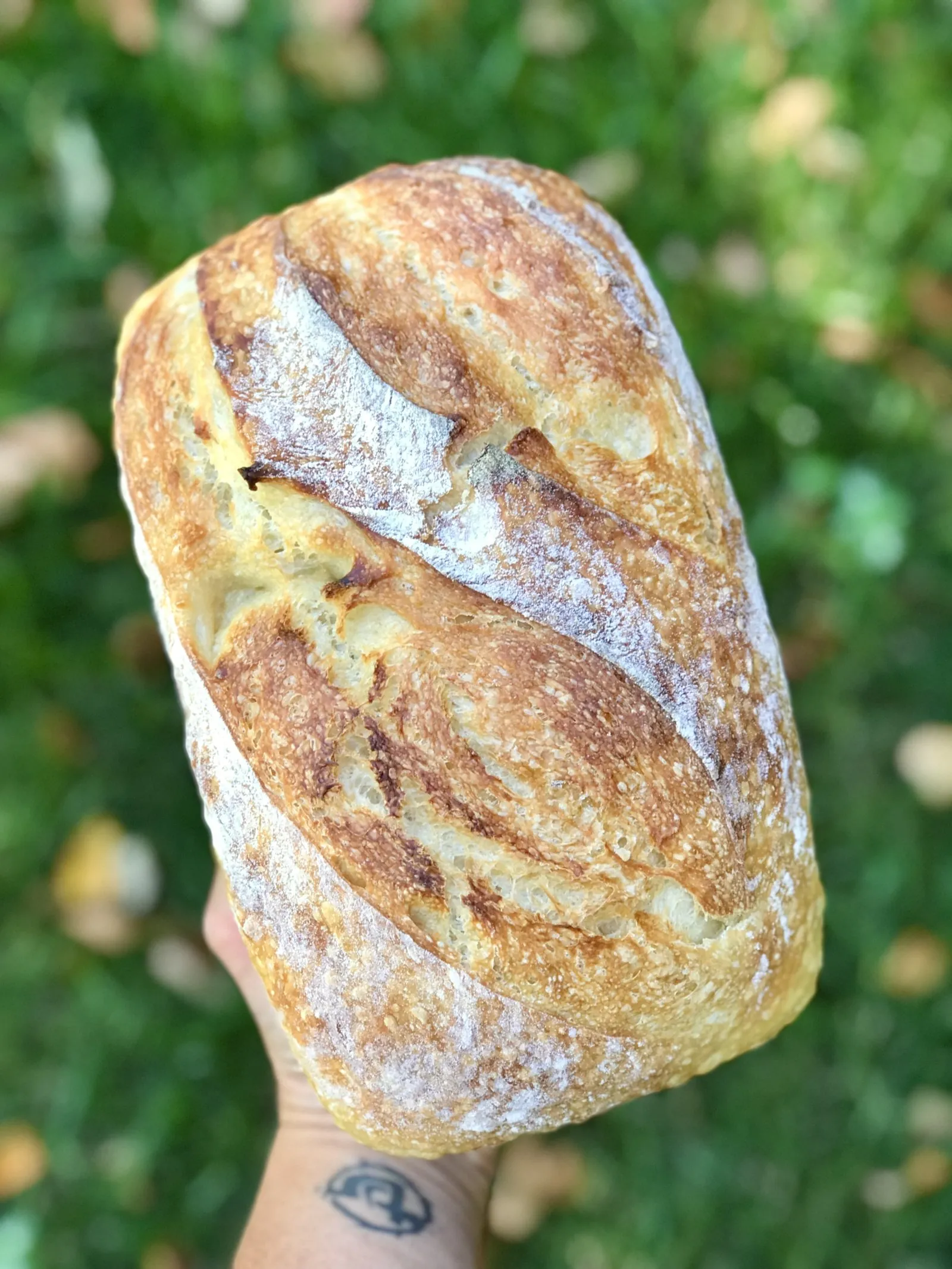
A hand holding up a finished sourdough boule, scored in a wheat-ear pattern, against summer grass
Everything is made on the day and sold on the day. What doesn’t sell comes home.

The product, undressed

No butter melting on it. No jam. No board, no linen, no basket.

This is how the bread is photographed everywhere the brand appears, and it is a decision, not a shortcut. If a loaf needs a styling kit to look worth twelve dollars, it is not worth twelve dollars.

Part One  ·  Their Story

The family behind the flour

Rebecca closed the daycare in 2020.

That is a short sentence for a decision that was not short. A home daycare is a room full of other people’s children and a ledger full of other people’s trust, and closing one means telling families to find somewhere else to be by Monday. She closed it to bake bread.

What she carried out of that decision was a jar.
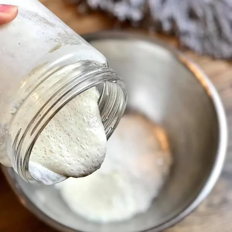
Agnus, the sourdough starter, pouring in a slow ribbon from a glass jar into a metal mixing bowl

Meet Agnus

The starter is called Agnus, named after Rebecca’s great-grandmother, and it has been fed every day since 2020.

People who keep sourdough talk about a starter the way other people talk about a dog. It sulks in a cold kitchen. It wakes up in July.

Naming one after a woman in your family is not a positioning exercise. It is what happens when you keep something alive long enough that it earns a name.

The first table was at Rowan’s Ravine, weekends only, catching people on their way to the lake. Then Victoria Park: Wednesday and Saturday, nine until one, May through the second week of October, and the Brandt Centre indoors for the long half of the year that Saskatchewan spends below zero. Then Quinn left his office job, which is the part most people skip past and shouldn’t. One person leaving a job to bake is a decision. Two people leaving is a household deciding that the bread is the plan.
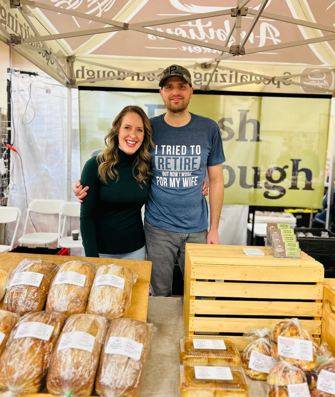
Quinn and Rebecca standing behind their market stall under the branded Ambitious Baker canopy, bagged loaves stacked on crates in front of them
Quinn and Rebecca at the stall. The canopy, the bags and the labels are the entire retail environment this brand gets.

Ambitious is delicious.

The menu is short and does not apologise for it. White, whole wheat, cinnamon raisin, dark rye, seeded, jalapeño cheddar, cheesy garlic. Bagels by the half dozen. Brioche buns. Cinnamon buns, four to a box. Nine dollars fifty to sixteen.

Here is the fact the whole project turns on. The cheesy garlic loaf is the most expensive loaf on the list, and it is the one they call their most-loved. The cheddar bagels, at fifteen dollars a half dozen, are the bagel that goes first. In a category where price is supposed to be the objection, the top of their price list is the top of their sales.

And two sentences on their website tell you more about how this business works than the price list does.

“No online store, we bake fresh for the markets.”

“We no longer take custom orders.”

Both are refusals, and both are unusual. The obvious growth move for a bakery with a following is to add shipping, add pre-orders, add a custom cake tier, and turn the audience into a funnel. Quinn and Rebecca went the other way. They fixed the capacity, kept the menu short, and left the constraint in plain view on the homepage.

That refusal is the most valuable thing the business owns. It is also the thing that made the design problem hard.
Part Two  ·  The Work

Making twelve dollars look like a fair price

The bread was already worth it. The question was whether a folding table could say so in four seconds.

The constraint

A loaf runs nine fifty to twelve dollars. Bagels reach fifteen fifty a half dozen. That is two to three times grocery bread, in a city where people are direct about value and quick to read anything that overreaches as putting on airs.

Most premium food brands buy permission with a room. A café’s lighting, its chairs, the noise of the espresso machine all argue for the price quietly before anyone orders. Ambitious Baker has no room. There is a canopy in Victoria Park, a shelf at Local & Fresh on Hamilton Street, and a shelf at the Wandering Market in Moose Jaw. A shelf gives you about four seconds. A table gives you the length of a walk-past.

The category had also stopped helping. By 2020 everybody had a starter. Artisan had become background noise, which meant the usual visual shorthand for quality — kraft paper, chalk lettering, a wheat sheaf — was no longer evidence of anything. It had become the thing cheap bread wears to look expensive.

So the brief was never “make it look artisanal.” It was: make the price look obvious.

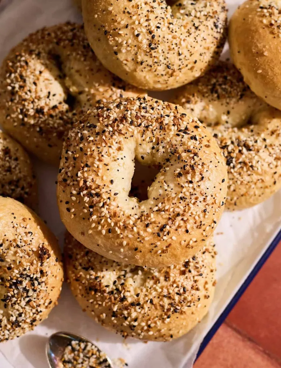
Everything sourdough bagels topped with garlic, onion, sesame and poppy seeds, sold by the half dozen

01

The price

$9.50 to $16. Two to three times what a grocery store charges for a loaf of bread.

Regina Saskatchewan

02

The city

Regina pays for good things and walks away from anything performing at it.

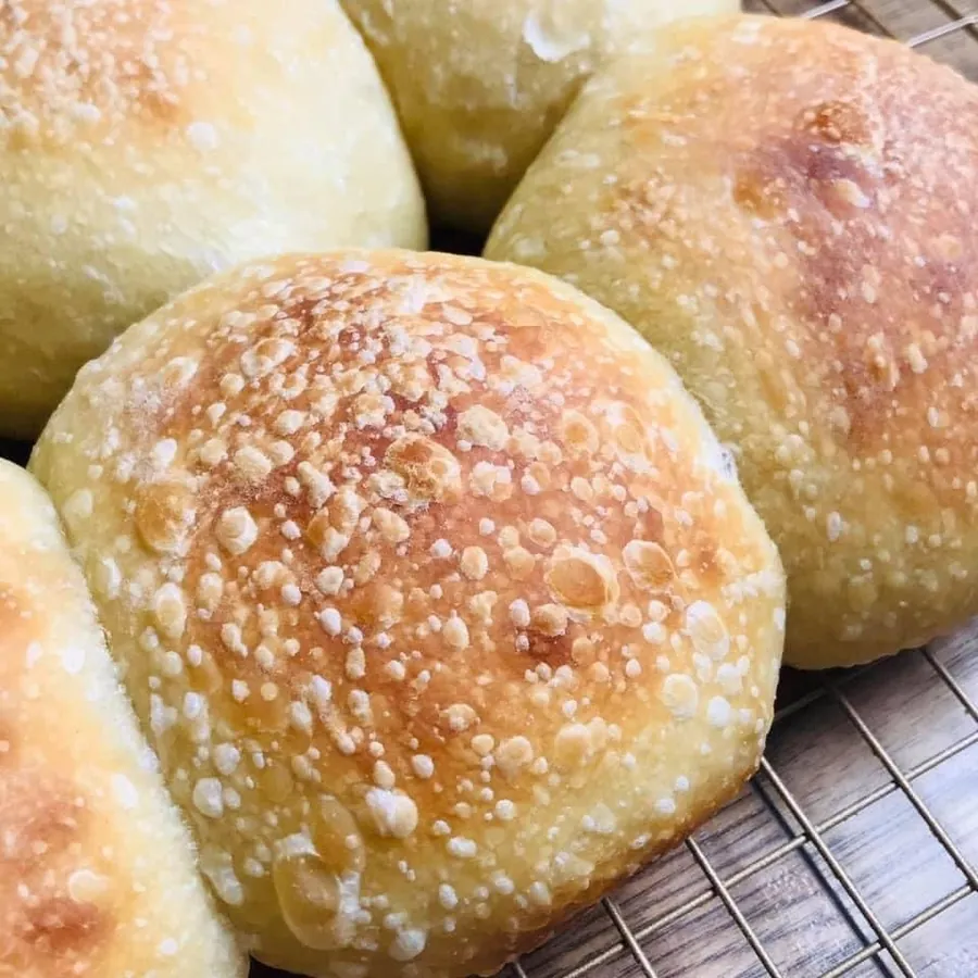
Brioche sourdough buns, sold by the half dozen

03

No room to help

A canopy and two shelves. No lighting, no service, no ambience doing the arguing.

The read

Four things made this work, and only one of them was design.

We knew the market. This was never going to be a direct-to-consumer brand with a national voice. It is a Regina business selling to Regina people, at a market in Victoria Park and on two shelves within an hour’s drive. The identity had to fit that shape, not a bigger one it might grow into.

The client was straight with us. Quinn and Rebecca were clear about what the business was and what it wasn’t, which is rarer than it sounds and is the reason the work went further than a logo.

The product already justified the price. Design cannot manufacture that. Where it doesn’t exist, branding becomes a promise the product breaks, and the customer only buys once. Here the bread was worth twelve dollars before we touched anything.

And most of the job was subtraction. Nearly every decision on this project was something we took out.

Which follows from the constraint. If the shorthand for quality has been worn out by everyone else, adding more signals makes you look like everyone else trying. The only move left is to remove anything that reads as claiming, and let a confident, unfussy mark sit next to the price so it gets taken at face value.

Routes explored

  1. Kraft and chalkboard Killed

    The default visual language of every artisan bakery in Canada. It would have made them read as a bakery. It would not have made them read as this bakery, and on a shared shelf that difference is the entire job.

  2. Wheat, sheaves, prairie iconography Killed

    Locally accurate and completely undifferentiating. In Saskatchewan, wheat is not a claim. It is the landscape.

  3. Bread with everything on it Killed

    The appetite route. Jam, melting butter, a cheese pull, a sandwich stacked until it barely closes. It sells, and it costs you the loaf.

  4. Flat, like the prairie Built

    Not the prairie as a picture. The prairie as a way of drawing: no depth, no ornament, nothing hiding behind texture.

The decision

Flat, like the prairie.

The obvious move with bread is to make it look delicious, and in food work that means adding things to it. Jam. Butter going soft. A cheese pull. A sandwich stacked until it barely closes. That is how most bakeries sell bread. It works. We didn’t do it.

The reason takes one line. Bread is the centre of the meal, not the thing you dress up to make one. Put jam on it and the jam becomes the subject; the loaf becomes a surface. If the price is going to hold at twelve dollars, the bread has to be worth looking at with nothing on it.

So the mark is a single loaf, drawn flat. No gradient, no shadow, no crumb texture, no wheat, no basket, no linen. Flat like the country it came from, and legible at forty millimetres on a label or across a park on a Saturday morning.

It is the harder version. A flat mark has nowhere to hide. Neither does the bread.

The work, in place

A baker's hand scoring a raw sourdough loaf with a blade just before it goes into the oven
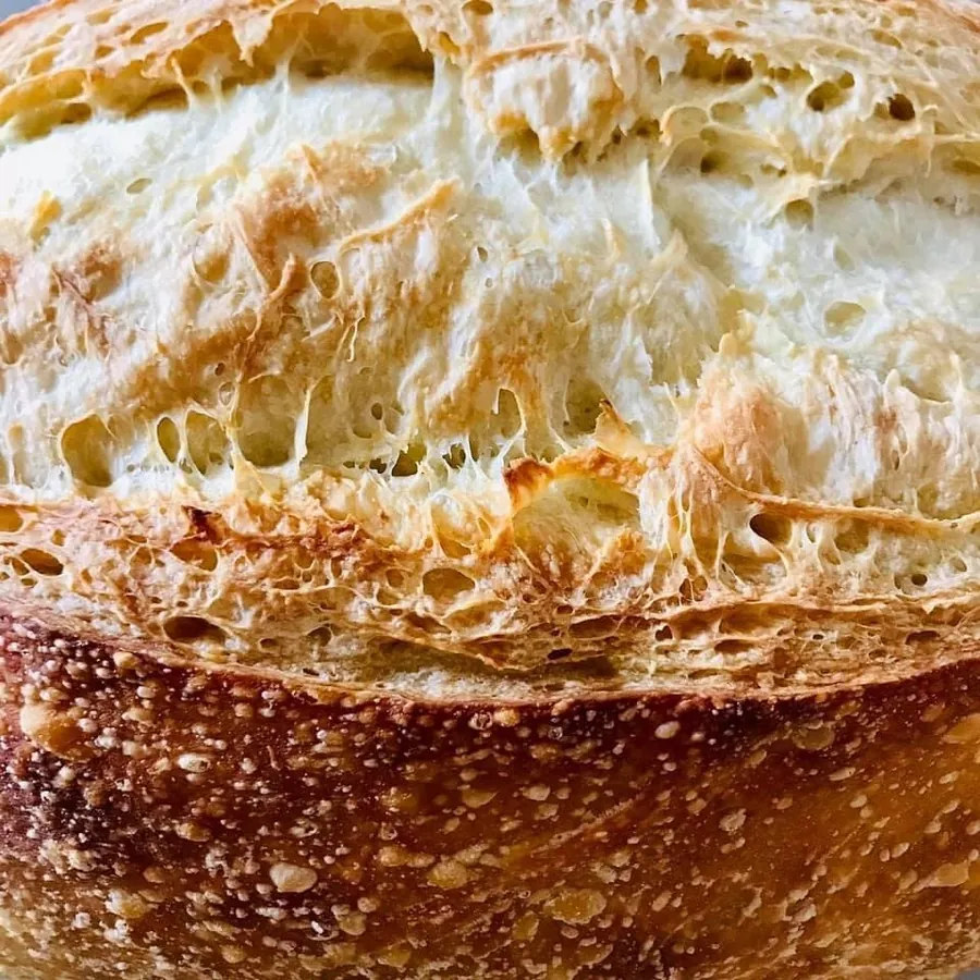
A sourdough loaf cut open to show an open, irregular crumb
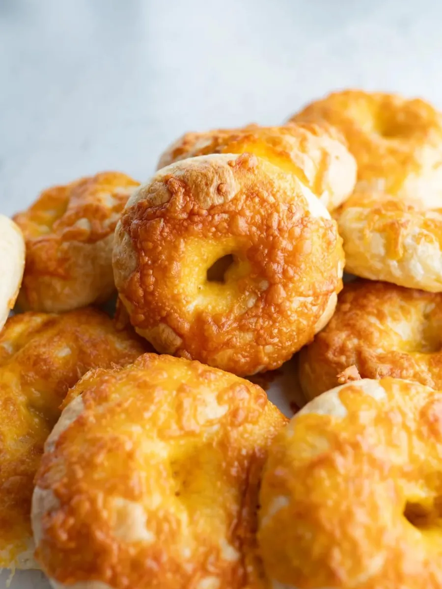
Cheddar sourdough bagels topped with browned old cheddar
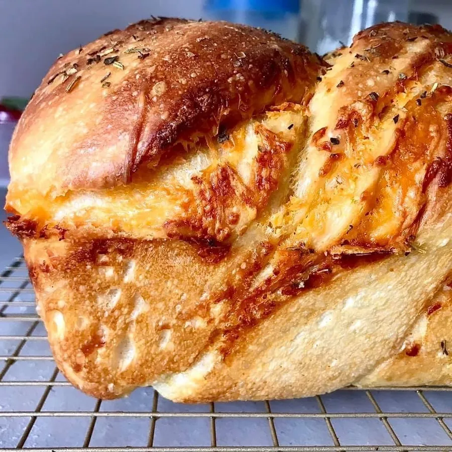
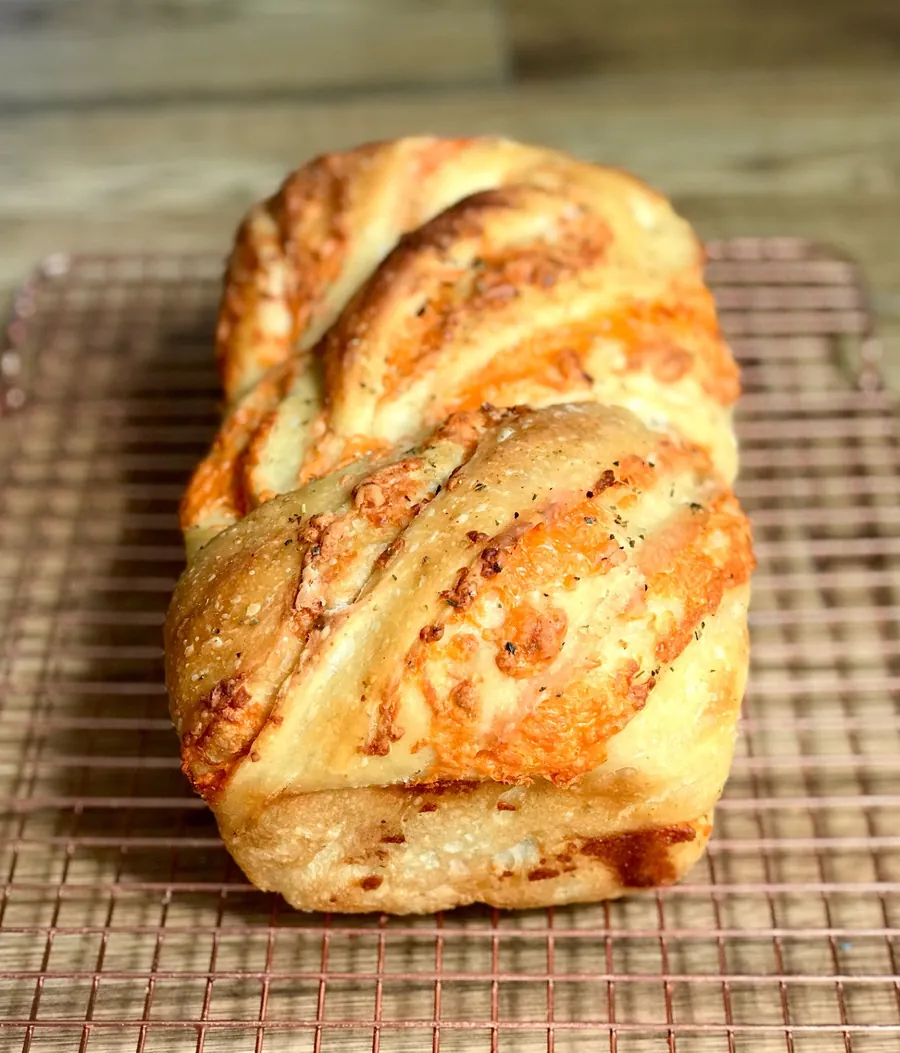
The cheesy garlic loaf, cheddar and garlic swirled through the crumb and topped with Italian herbs
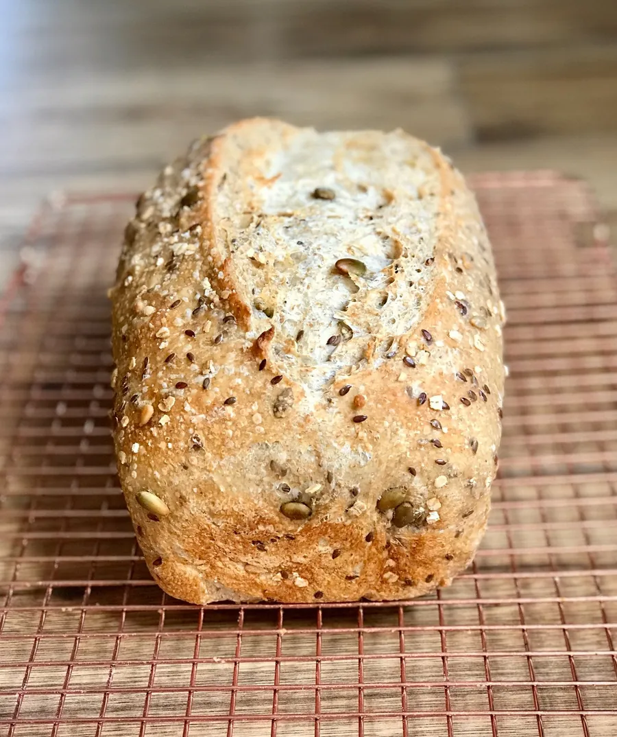
The seeded loaf, a whole wheat and white blend crusted with sunflower and flax seeds
Everything bagels stacked, seeds and garlic visible on the crust

Shot on the table and in the bag. Nothing here is a render.

Shot 01  ·  needed

The bag on the Local & Fresh shelf, in frame beside cheaper bread

Proves the price in company

Shot 02  ·  needed

The Victoria Park line-up, shot from behind the table at nine fifteen

Proves the demand, not the stall

Product shots prove the bread is good, and the stall photograph proves the table exists. Only these two prove the brand holds its price in company and pulls a queue. When they exist, drop them into these frames.

Part Three  ·  What Changed

Wil — one honest outcome and one real quote before this ships. Do not claim their sales. Claim your part, and let the number be small and true. Text Rebecca one question: “What changed that you actually noticed?” Her answer, verbatim, replaces the line below. Then delete this block and the cs-slot class.

“People come to the table already knowing the name of the starter.”

Rebecca  ·  Ambitious Baker  ·  placeholder, not yet sourced

What we can say without asking anyone: the brand is known in this city by name, it holds a price at the top of its category, and its most expensive loaf is the one it calls most-loved. The design is not why the bread is good. But nobody hesitates at the price any more, and that was the job.

In their customers’ words  ·  published at ambitiousbaker.ca

The best sourdough in the city.Conrad
This is the only sourdough bread I buy in Regina.Alicia
I discovered Ambitious Baker’s sourdough at the Regina Farmers’ Market and was blown away.Kelsey

Keep reading

Next

Every business in Regina has a story like this one. Most of them have never had it written down.

See the rest of the work Start a project